<!-- /* Font Definitions */ @font-face {font-family:"Times New Roman"; panose-1:0 2 2 6 3 5 4 5 2 3; mso-font-charset:0; mso-generic-font-family:auto; mso-font-pitch:variable; mso-font-signature:50331648 0 0 0 1 0;} /* Style Definitions */ p.MsoNormal, li.MsoNormal, div.MsoNormal {mso-style-parent:""; margin:0in; margin-bottom:.0001pt; mso-pagination:widow-orphan; font-size:12.0pt; font-family:"Times New Roman";} table.MsoNormalTable {mso-style-parent:""; font-size:10.0pt; font-family:"Times New Roman";} @page Section1 {size:8.5in 11.0in; margin:1.0in 1.25in 1.0in 1.25in; mso-header-margin:.5in; mso-footer-margin:.5in; mso-paper-source:0;} div.Section1 {page:Section1;} -->
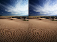
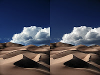
A quick and easy trick to make your skies more aesthetic:
You may notice in some images the most amazing blue skies and you are not quite sure what it is about them that is so appealing. In some cases, it is lack of cyan. While this will not be a universal tip for skies, it works in many cases, particularly when you are creating darker images.
When you darken a sky in Photoshop, especially when using luminosity masking, you will get these kind of muddy dull cyan colors mixed in with the brighter areas of the sky, particularly when the sky is filtered by clouds and horizon haze. To fix this, open up a hue and saturation adjustment layer. Select Cyan from the menu and then move hue to the right until you have the desired sky. Then mask out the rest of the image to preserve the color balance you achieved on the raw import. A quick little fix like that can make or break an image.
Similarly this can be done when you have large bodies of clouds. In these cases I find simply de-saturating the cyan out of the clouds gives a better cloud color. Keep in mind when you are removing this cyan, what you are doing is creating an image that is closer to what we on some level believe it ought to look like. Clouds are black and white with shades of gray. Skies are a Parrish or cobalt blue. Similar things can be done with yellows to greens, though the adjustments are often more slight.
The point of this tip is to bring to attention the power of targeted hue adjustment. In the example images consider that sand is orange and the sky is blue which are complementary colors. If the sand was more yellow, I would consider targeting it to make more orange or targeting the sky to make it more magenta. This is applying basic but effective color theory to a static environment.
Next:

